
Godsforge Development Interview with Kyla McT
Godsforge released May 1st. Today, we interview game developer/producer Kyla McT about how the game went from prototype to reality. Find out about sparkly dice, heartbreaking trays, and making iconography delightful below!
What caught your eye/made you decide this game was worth producing?
Kyla: I could tell how much work had gone into it. Often prototypes I play are kind of slapdash, and sometimes that can even be a good thing. But I could tell that Brendan had put years of work into this game: the mythology, the creations, the balance. We changed quite a bit over the development of the game, but the element costs of the spells and creations barely changed at all. It was already such a rich world and well-balanced card set when it got to me.

Was there anything on this game that you obsessed over?
Kyla: The iconography, for sure. I’m all about readability and usability, but this game has such a unique look that I wanted to make sure the icons went along with it. It’s not always easy to strike that balance. Here’s a snapshot from development showing some different looks I was playing with, for the element cost on my favorite card.
It’s important for the theme that you know these elements that you are crafting have names: fire, light, bloodstone, godstone. But ultimately, playability won the day and I took the name of the elements off the icons to make crafting them a little bit less complicated. Iconography (for numbers) in development.
What’s something you put a lot of thought into that might not be obvious at first glance?
Kyla: Honestly I put a lot of thought into everything! I’m not sure what’s noticeable and what’s not. The name, maybe. Names seem so straightforward and obvious in hindsight but we discussed a lot of possibilities for this game. It was called Etherium Forge when I first played it. There are a handful of other games out there right now with “forge” in the title but I really felt like forging these creations was integral to this game in a way that I couldn’t find another word for.
Tell us about trays.
Kyla: Agh! Trays and dice. I learned a lot about plastic with this project. It was a little heartbreaking to see Tom Vasel’s Godsforge unboxing and he’s got a broken tray. I haven’t heard a single other report of a broken tray, so that might’ve just been bad, bad luck. But I’ve learned since then that you always want to specify PET plastic for your trays. I’m an organizer so I try to make thoughtful, useful trays.
What’s something you learned on this project that you’ll apply to future projects?
Kyla: To trust my instincts. I really appreciate - and am instantly drawn to - art that’s different, that doesn’t look like other games out there. I’ve done that before on Atlas projects (Hounded is a good example - I fought to keep the game designer’s original geometric art on that game) but I really took that to the next level with Godsforge and Diego. His work is so original, so striking, so modern, I fell in love with it immediately. It felt like a risk at the time - what if my tastes are too “out there”? I’m so glad the feedback to it has been as positive as my initial opinions.

Can you share a surprise/challenge/setback? How did you overcome it?
Kyla: I wanted sparkly metallic dice! None of my manufacturers would do them. Looking back, I think it might have been a gaudy choice. I’m really pleased with how the marbleized dice came out.
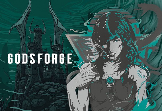
Favorite card, component, or piece of art?
Kyla: My favorite piece of art is hands down the Shadow Gorgon [pictured above]. She was one of the first pieces of art completed and I fell in love with her right away. When I’m playing though, I’ll always try to get Scepter of Fortune out first if I can.
Godsforge was designed by Brendan Stern, produced by Kyla McT, and published by Atlas Games, with art by Diego L. Rodriguez. You can learn more about it here!